The other day I was discussing it with Carola and others seem to agree: the “new” Vogue Paris, under the direction of Emmanuelle Alt seems…well, how to put it…it seems quite plain. Don’t get me wrong here!! I love Emanuelle’s work, she is a great stylist and I was always crazy about her editorials! Still, there is something off about the layout of the two latest issues of French Vogue..the font is too basic, everything is just too clean!
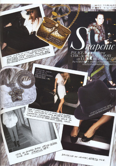
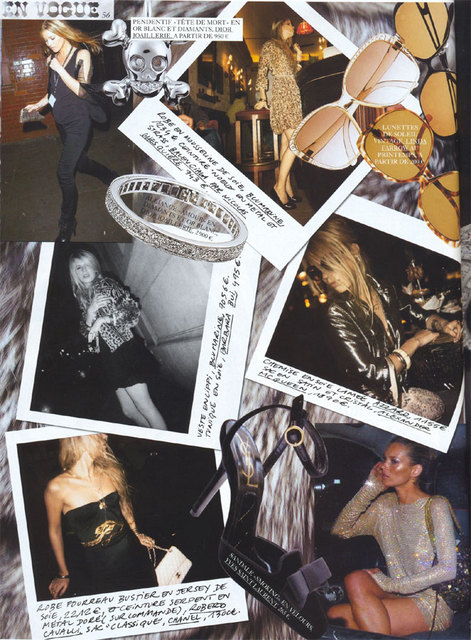
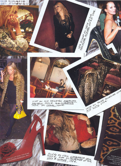
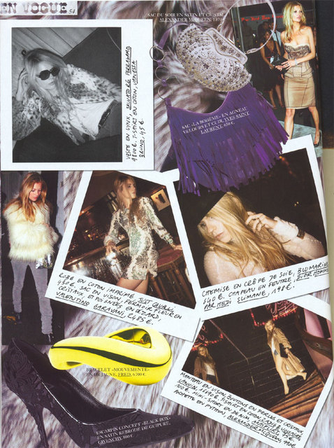
With Carine this was different, as she used to clutter the pages with inspiring pieces, sexy details, old pictures and hand-written notes.
I adore this En Vogue spread from December 2005 about the Kate Moss style, featuring Eugenie Niarchos. It is an example par exellence of Carine’s way of doing Vogue:


Ohhh, we miss you Carine!!!!!
Btw. check out this great interview with Carine in the Financial times: http://www.ft.com/intl/cms/s/2/aa714ad8-8266-11e0-8c49-00144feabdc0.html?ftcamp=rss#axzz1NGD1FAIQ